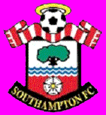
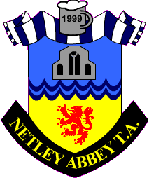
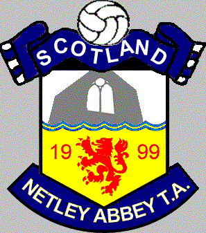
Option 1 This is based on the Southampton FC badge, and came from an idea in Prague from Paul and Helen. There are several variations on this theme below, based on different images in the top half of the shield. Basically - the ball and scarf should be self-explanatory (we tried a bar scarf, but it didn't look like a Scotland one). The top image is of a window frame in the Abbey ruins, the waves represent Southampton Water, and the year is that of formation. This is Rich's favourite, but despite coming up with the original idea, both Paul and Helen are a little uncertain about how it would look in "real life". Rich is right in that it is instantly recognisable as Southampton-related, which does go in it's favour. The badge on the left was used as the shape, but the "split-shield" was abandoned in favour of a single shield. [Based on] [Variations] |
 |
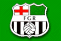
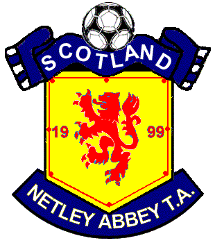
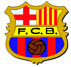
Option 2 A blatant rip-off of the Forest Green Rovers badge (which is, of course, a blatant rip off of the Barca badge). The red and white stripes represent Saints, but can also be interpreted in favour of Aberdeen, Clydebank or Worthing. This was probably Paul's favourite, at a push. [Based on] |
 |
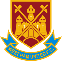
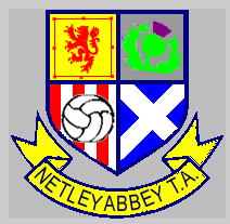
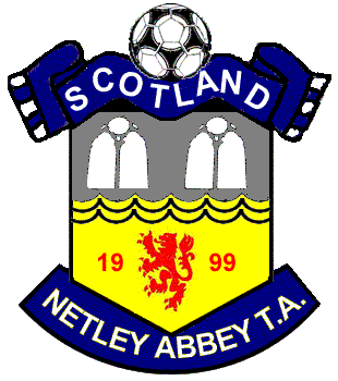
Option 3 Although the shape is from the West Ham badge, this design is a step away from obvious rip offs. Again, the red and white stripes represent the club teams, but the other three quarters show the designs from the NATA badges in previous years. There is scope to change the colour of the ribbon. Paul liked this one too. [Based on] |
 |
 |
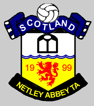
This is the Saints badge, with the "new" football (it was previously an 18-panel ball). The idea was to take a shape that was instantly unique and recognisable to the area and twist it to fit NATA. |
 |
 |
| This was the original sketch - the foaming stein is reminiscent of the ball/halo on the Saints badge, and the abbey is a stylised rendering of how the south wall would have looked.
|
This version shows the scarf without the bars, and a stylised version of the window. A ball has replaced the stein. |
 |
 |
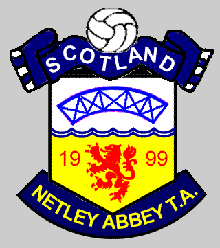
| As the top half of the shield was causing so many problems, some alternatives were explored - this shows the Blue Bridge.
|
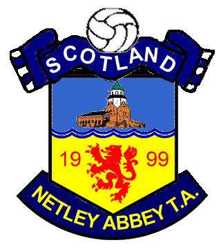
And this shows the Vicky Chapel. |
 |
 |
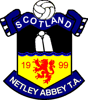
Rich had seen this window on the English Heritage site, and wanted it based on this - this is a direct mock-up of the photo.
|
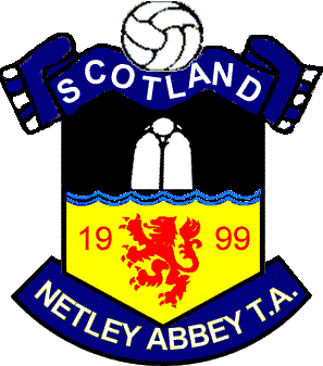
And this is the mock up with the window straightened. The general consensus was this is too dark (although I'm wasn't so sure!). |
 |
 |
| This is a direct variation of Option 1 shown above, with a more stylised and angled Abbey building. | It was suggested that we add symmetry to the badge by adding a second window. This was then abandoned as it looks like a cartoon face!
|
 |
 |
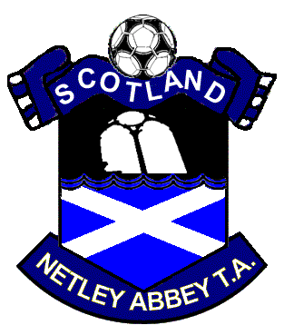
| Chris suggested a saltire instead of a lion rampant - first of all we tried it with the window, but again this was thought too dark. By now, we were also questioning whether we wanted the window at all - as Norton eloquently put it - "do you want to be known as the Glass Windae Tartan Army?" | This came just after the final design was agreed, in order to provide an alternative, in case the winning design was considered "too Rangers-esque". The saltire/lion combo got the thumbs up, however. |
 and...